performance optimization with flamegraph and divan
by on Monday, 29 April 2024
Not long ago, I came across a genuine case of code that needed optimising. I was really excited, as it's not every day that you can say this from the outset, and in this particular case, I was pretty sure that there was plenty of room for improvement, but I didn't know where.

how did I know?
One of our backend services was having trouble with the latency of the requests, up to such a point that it was causing instability. Basically, requests were so slow they caused the pods to timeout and get killed. We'd tracked this down to a specific type of request that required an expensive filtering operation. We knew it was expensive, but until this type of request had increased to over 50% of the requests in a specific region, it hadn't been an issue. Now it was.
As a quick experiment, we tried removing this filtering, and it made a very large difference.
Before going any further, let's make it easier to follow what I'm talking about and actually describe this mysterious filtering.
aside: corridor filter
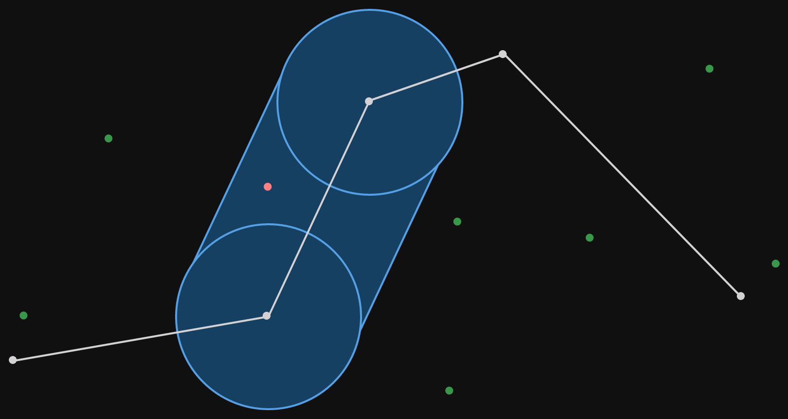
To set the scene, our context is filtering geographical points (points on a map). A corridor filter is a polyline with a radius. What does that mean?
A polyline is literally multiple lines, stuck together. In our case, we'll set the requirement that each point connects to two others (although overlapping and closing the polyline are allowed). Here's an example.

The radius means that we consider all the space that is r meters (because we're sensible and we use the metric system) from any part of the polyline. Visually, this can be shown as circles of radius r around each point and rotated rectangles centered on each line segment. This visualization can be seen in the image below. The corridor is all the area covered by the blue shapes.
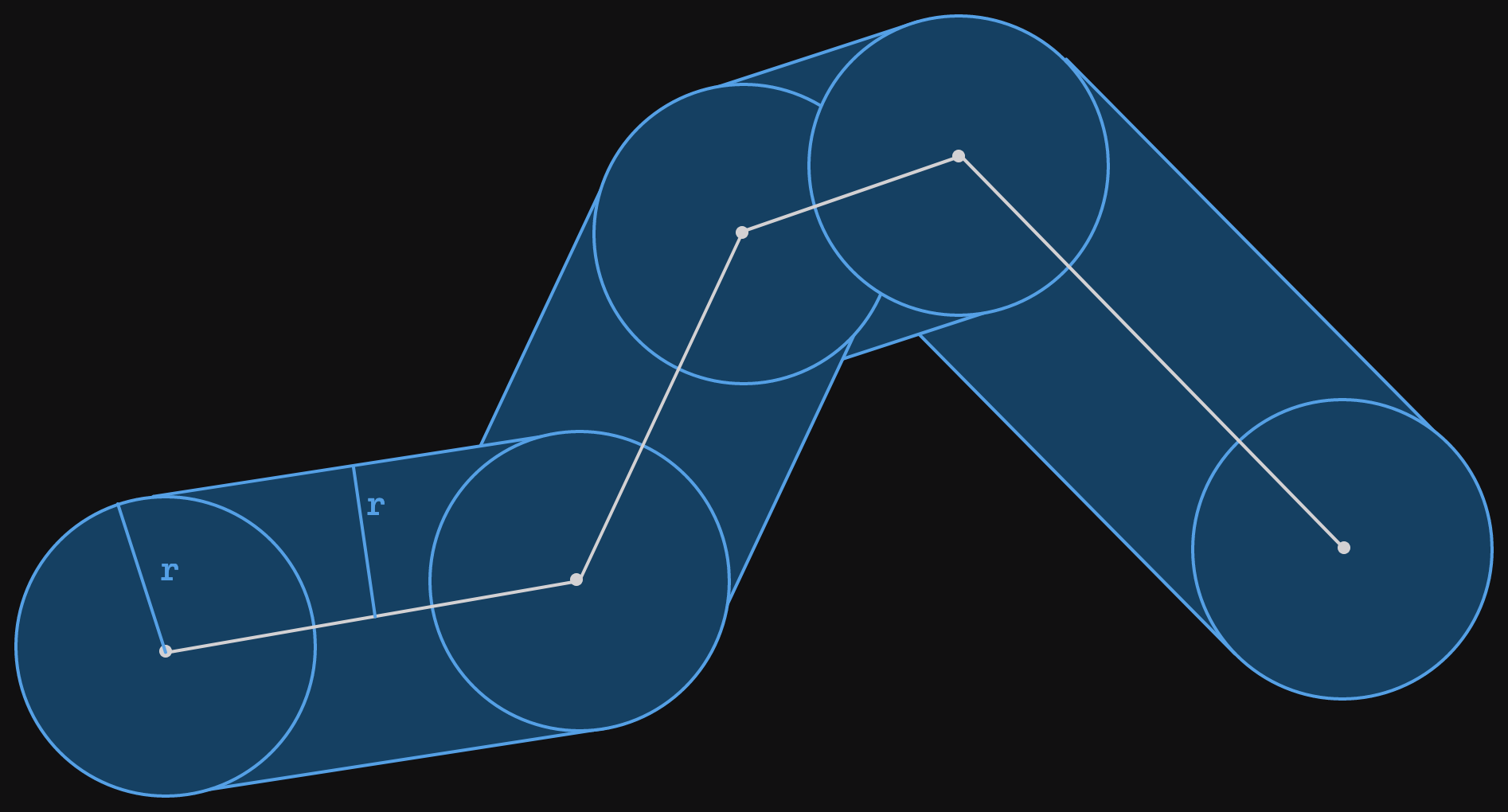
The radius r has been marked on the left most circle and rectangle.
That's our corridor. The corridor filter is a function that takes a corridor (polyline and a radius) and a set of points and returns only the points that are inside the corridor. Let's add some points in the same space as the corridor.
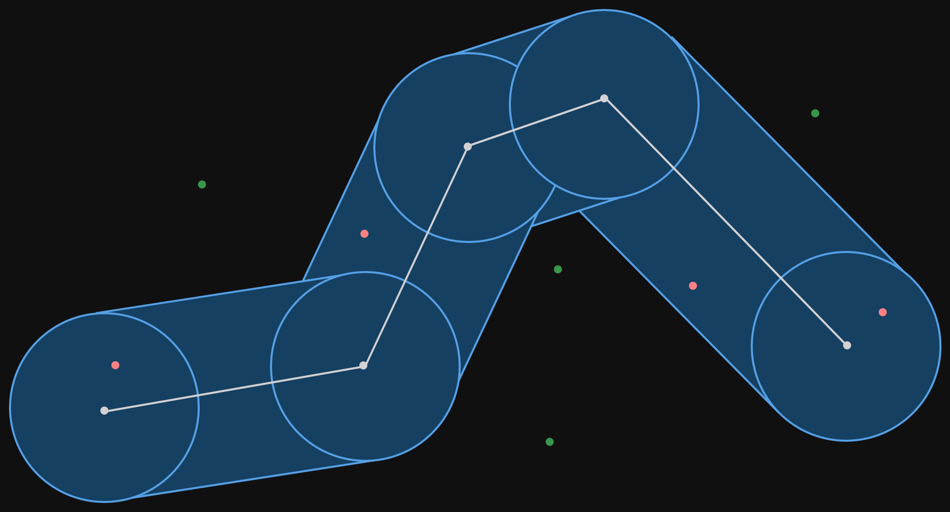
The points which fall inside the corridor are colored red, those that fall outside the corridor are colored green. The filter for this corridor would return only the red points.
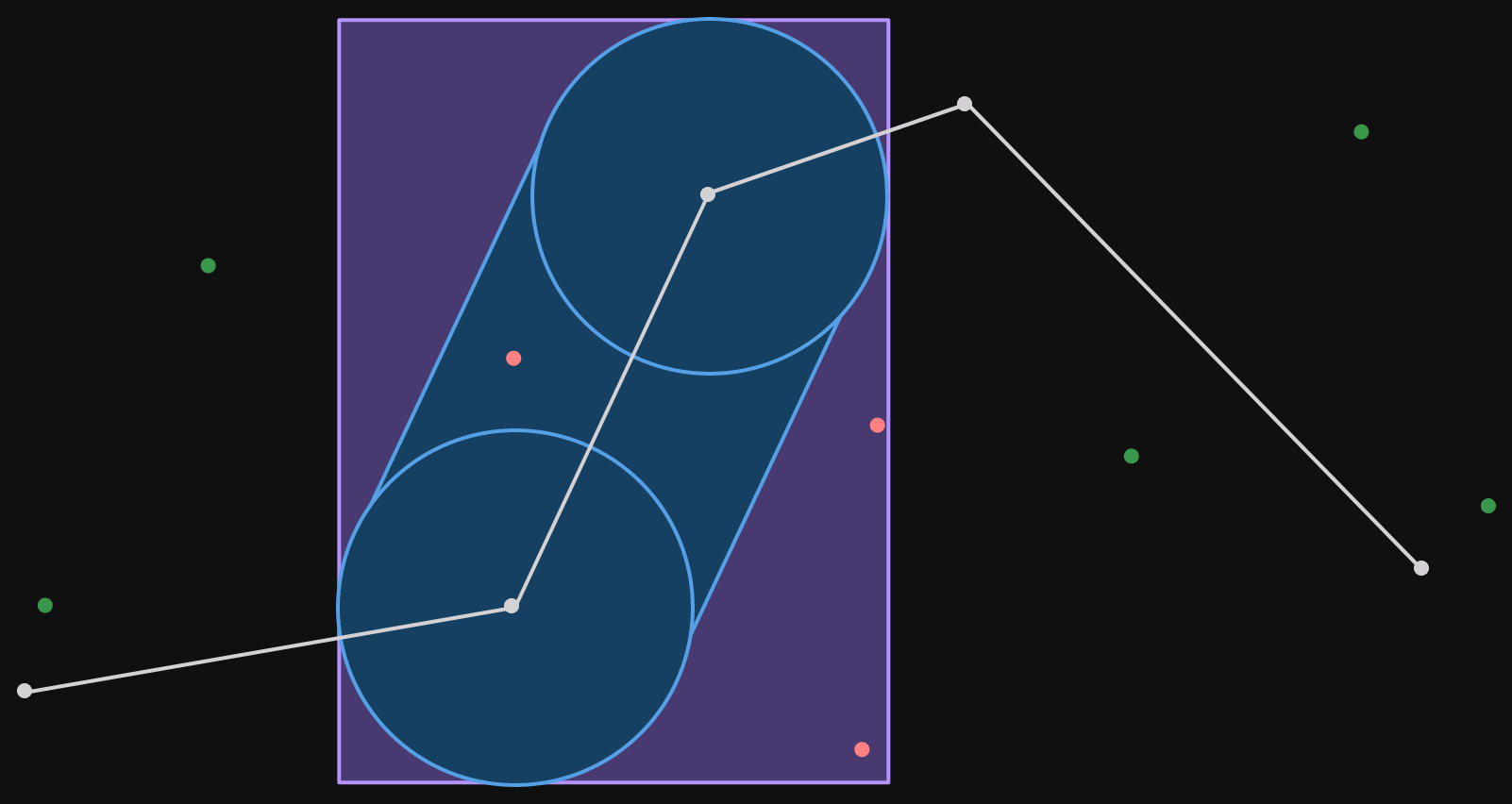
It is not only for illustration that the points are all close to the corridor. In the service, we select the points to filter for out of an index. The points that we preselect are those in a bounding box around the corridor itself. A bounding box is a straight (not rotated) rectangle drawn around some group of objects, in our case the corridor.
Notice how the bounding box can't be any smaller and still contain the corridor within it.
Now that we understand what a corridor filter is, let's go back to the experiment.
removing the filtering
As you can see from the image of the corridor with points inside and outside it, the corridor filter is a refinement step. We start with a set of points which are close to the corridor (within the bounding box) and then check which ones are inside the corridor.
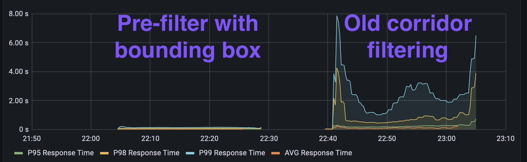
As an experiment, we switched out a corridor request coming to the API for the bounding box around the corridor. This would mean that we have to serialize additional data, but the corridor filtering wouldn't be needed. We used this test to validate our assumption that the corridor test was the most expensive part of handling requests.
Using a set of requests previously seen in our worst performing region, a performance test was run, scaling up the number of requests. An initial test was run with the corridor filtering active, and then the second test was run with just the bounding boxes - all using the same request pool.
The results are quite clear when visualizing the response times (average, p95, p98, and p99). p99 response time means the 99th percentile of response times for some window - if you order all requests by response time and remove the slowest 1% of requests, the p99 response time is the slowest time that is left.
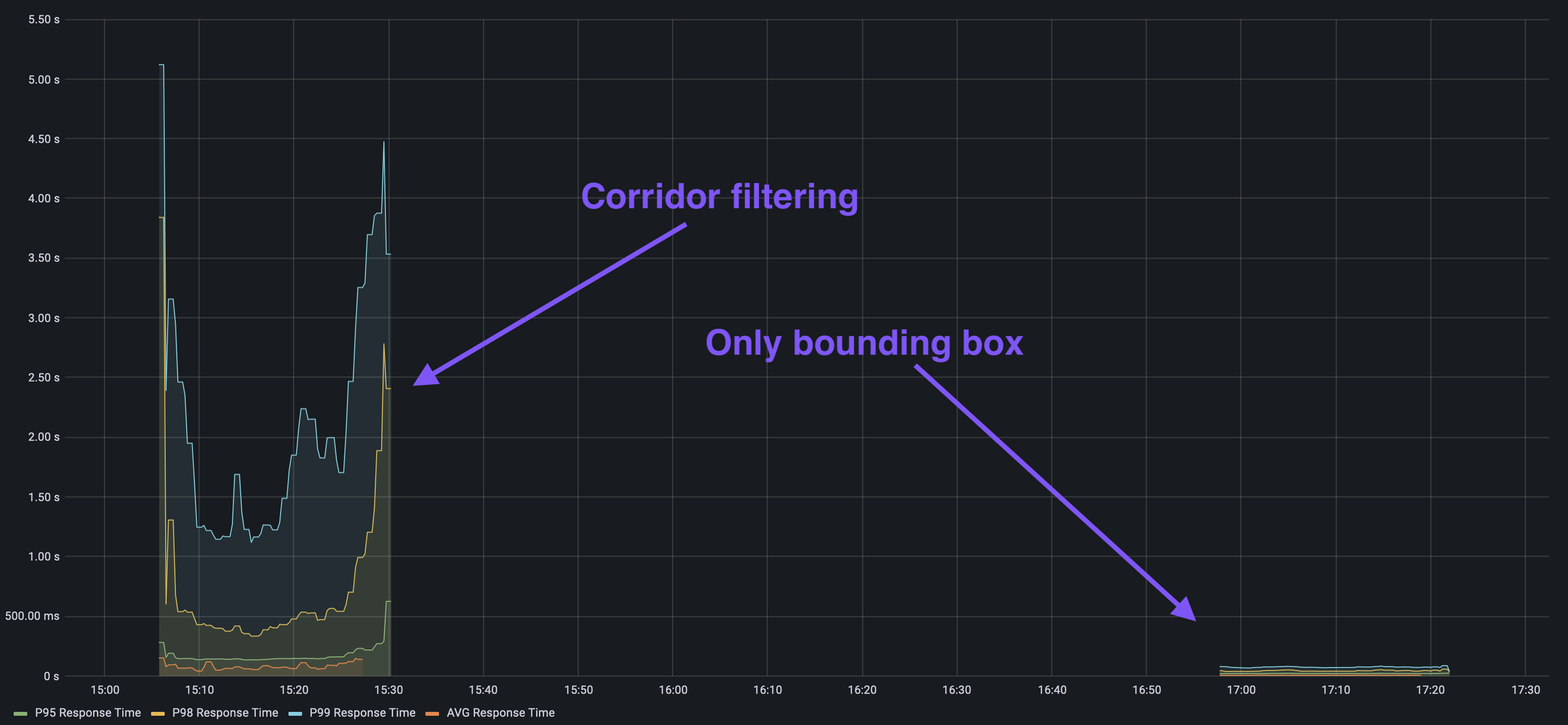
So by removing the filtering, we reduced even the p99 time below 200 milliseconds, whereas both the p98 and the p99 had grown to over 2 seconds in the previous test. Clearly, the filtering was the most expensive part of serving requests. This sort of performance test can be really valuable to test assumptions on real workloads. We have an internally developed tool for this at work, but there are plenty of alternatives available.
We can't just take the filtering out though, our end users expect the results returned to be only those within the corridor, not the ones in a bounding box around the corridor.
We've definitely got an algorithm that needs optimizing. The next question is whether it can be optimized, and for that we need to look at where it's spending time. Let's see how to do that.
flame graphs
Flame Graphs are a visual analysis tool for hierarchical data. As far as I can tell, they were created by Brendan Gregg, and it is certainly his writing on flame graphs and his tool to convert profiling data into interactive SVG flame graphs that has made them popular.
Flame graphs are most commonly used to visualize CPU profiling data (although they're used for all sorts of other measures as well). Where the call stack forms the flames and the width of each section indicates how many samples were recorded in that particular call stack. A flame graph groups all the matching call stacks together, so there is no notion of the series of execution - if you want that, you need a flame chart instead.
Let's illustrate what we expect to see from a flame graph. Here's some simple Rust code:
fn main() {
    // Some work here in main first
    cheap_thing();
    expensive_thing();
}

fn cheap_thing() {
    // Do some light computation here
}

fn expensive_thing() {
    for _ in 0..10_000 {
        expensive_inner();
        more_expensive_inner();
    }
}

fn expensive_inner() {
    // Do some heavy computation here
}

fn more_expensive_inner() {
    // Do some **really** heavy computation here
}
A flame graph for this code might look something like the following.
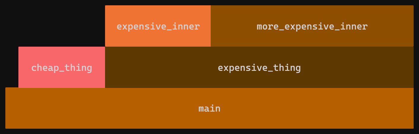
Since the entire execution starts from main(), the bottom level of the flame graph is a single box. The second layer represents functions called from main(). We have a small gap for samples which were taken within main itself corresponding to the comment // Some work here in main first, the rest is covered by a narrower box labelled cheap_thing and a wider box labelled expensive_thing. The wider box indicates more samples were taken there, which corresponds (probabilistically) to the CPU spending more time there. From this flame graph, we see that no samples were recorded in any function called from cheap_thing, but that samples were recorded in the 2 functions called from expensive_thing. Once again, the widths indicate execution time spent in each one.
Of course, real flame charts aren't usually so neat. Amongst other things, main() is actually a series of std library calls.
If we were optimizing this code, we can see that we probably want to start with expensive_thing and the 2 functions it calls.
flamegraph in rust
When I first used flame graphs it was from C++. This usually involved a multistep process where you have to set up a specific (release like) build, profile it with perf, and then convert it to a flame graph SVG with Brendan Gregg's flamegraph.pl (yes, a Perl script).
If you're using Rust, it's much easier these days, you can use the cargo flamegraph command which does all of that for you! The GitHub README also has a good introduction to using flame graphs for system performance work. Now let's install the cargo command.
cargo install flamegraph
It's important to note that you don't want to install cargo-flamegraph which is an old, unmaintained project which does the same thing, but not as complete.
Once it's done, we can run it like any other cargo command.
cargo flamegraph
This will generate a flame graph SVG in your current directory.
To make the graphs more useful, set the following in your Cargo.toml so that your release profile gets debug symbols.
[profile.release]
debug = true
There are plenty of options to modify the sample rate and choose the target you wish to profile. In my case, I had some trouble selecting a unit test from a binary crate and so I ended up moving the code into a separate crate just for the purpose of optimizing it, I then ported the code back. This isn't ideal, but you sometimes end up doing this anyway so that benchmarks can be run on new and old code at the same time (more on that later!).
profiling the corridor filter
Computers are really fast. And even sampling almost 1000 times a second (cargo flamegraph defaults to 997 Hz), we may not get the best picture of where the CPU is spending its time. The easy answer to this is to do it lots of times. We set up our corridor and the points we want to test against, and then execute the filter in a loop. This will give us a more statistically accurate result.
Let's have a look at the result. It's an SVG, so you can render it in a web-site directly (like I'm doing below), but if you open just the SVG in your browser, it's interactive! You can click on boxes in the flame graph to zoom to it and make it occupy the full horizontal width. Try it for yourself by clicking on the image below to open the SVG.

Here we can see that most of the time is spent in main, which is expected. There's a high callstack on the right that takes up some time, if you check the interactive flame graph, you'll see that it's serde related. That's the set up process where we're loading the corridor and points from a JSON file, we can ignore that bit as it's not part of our actual corridor filter implementation.
But then it gets weird. From main it looks like we're calling directly into sin, cos, and asin functions from libsystem_m.dylib (I'm on macOS). We are definitely using these functions (welcome to geocoordinates), but we're not calling them from main. We also see calls to some of these trigonometric functions from outside of main. What's going on?
Inlining! The call stack depends on how our functions have been optimized by the compiler. Because we profile in release mode (with debug symbols), we see optimizations taking place, one of which is inlining.
Inlining is when the compiler takes the contents of a function and rather than keeping it separate and calling into it, inserts it wherever that function is called. For small functions, this often brings a reasonable performance improvement, but it does make performance analysis harder.
In Rust, you can assert some control over this process with the #[inline] attribute. In our case, we want to suggest to the compiler that we would prefer if certain functions were not inlined. For that we do the following:
#[inline(never)]
fn distance_to_segment_m(point: &Point, segment: &[Point; 2]) -> f64 {
    // Function body
}
Let's sprinkle a few of these around and try again. This may make our code slower, but we should still be able to get a better idea of where the time is spent.

That's much better, we can now see more of the call stack. Knowing the code, it still looks a bit odd to me, there are call stacks which seem to be missing intermediate functions. I don't know why this is, but it does seem to happen - performance profiling can be as much an art as a science at times.
So let's look at what we can tell from the flame graph. Looking from the top, we see that 77% of the total execution time was spent inside distance_meters. This is not what I was expecting. That function "just" implements the Haversine formula to calculate the distance between two points. The function does use the trigonometric functions which show up in the flame graph - it seems they are more expensive than we'd thought.
You can see that domain knowledge is important when analyzing the performance of your code (or anyone else's). Often, the biggest challenge is interpreting the results of the performance profiling within the domain you're working in. We'll see this again as we try to optimise this code.
optimizing the corridor filter
We've found out that measuring the distance between two points is the most expensive part of our filter. This wasn't entirely clear from the outset, as when measuring the distance from a point to a line segment, we first need to determine the point on the line segment which is closest to our point.
My gut feeling had been that this is where the performance bottleneck would be - however from our flame graph, we can see that distance_to_segment_m only accounted for 10% of the samples. Take this as a lesson, humans are bad at guessing about performance.
So, what can we do to improve the filter code. When filtering, we have to compare every point (let's say we have N) to all of the line segments in the corridor's polyline (let's say we have M), so we have NM distance calculations. Let's try and reduce that, or at least replace it with something cheaper.
Something cheaper than a distance calculation is a bounding box check. Checking whether or not a point is in a bounding box requires 4 comparison operations, which is much cheaper than the Haversine formula. Or at least we think it is.
As mentioned, for each segment of the corridor, we need to calculate the distance to every point. Let's take the second segment of our corridor and visualize this with the points we used previously.
We can see that out of the total 8 points, only a single one falls within the corridor for the selected segment. But to determine this, we need to perform 8 distance calculations.
Instead, let's draw a bounding box around the corridor segment. Calculating the bounding box for that segment is likely not much more expensive than a distance calculation, but once done we can use it for all points. Let's visualize what this would look like.
Now we see that 3 points fall inside the bounding box, the single point that is in the segment corridor as well as 2 more which aren't. This is a pre-filter, we still need to calculate the distance from these 3 points to the segment, but for the remaining 5 points which are outside the bounding box, that calculation can be skipped.
Of course, this is all very nice in theory, but before we start running our full service performance tests, it would be nice to see how our bounding box pre-filter performs compared to the baseline corridor filter. For this we're going to run some benchmarks!
benchmarking with divan
While optimizing our corridor filter we said "calculating the bounding box for that segment is likely not much more expensive than a distance calculation". It's OK to implement something based on your understanding of how expensive the computation is, but afterwards it's best to go back and validate that understanding - you'll often be surprised!
Now that we have our optimized corridor filter, we're going to compare it with the baseline. For this, I'm going to use Divan. Criterion is probably the go-to benchmarking library for Rust, but I wanted to try Divan because I'd heard about it from the creator, Nikolai Vazquez, at RustLab last year. I won't go into comparing the two options, because I have never used Criterion.
The set up is pretty straight forward and is described in this blog post. Create a file in the benches directory of your crate with a very small amount of boilerplate.
fn main() {
    divan::main();
}

#[divan::bench]
fn some_benchmark() {
    // do things here
}
One thing that I completely missed when I started using Divan is that you also need to update your Cargo.toml to include the bench.
[[bench]]
name = "benchmark"
harness = false
This is apparently also true for Criterion, and it's because the value for harness is true by default, but actually using Cargo's own bench support requires nightly.
To get a reasonable spread of benchmark results, we set up 4 scenarios. We have corridors of different numbers of points and varying numbers of "locations", each location is made up of various points. For each scenario we consider the number of locations to be filtered and the total number that fall within the corridor.
small_corridor: 4 point corridor, 13/15 locations matchmedium_corridor: 109 point corridor, 70/221 locations matchlong_narrow_corridor_few_total: 300 point corridor, 34/65 locations matchlong_corridor_many_filtered: 251 point corridor, 251/2547 locations match
I like the way that Divan allows you to organize benchmarks in modules. So for the first scenario, the benchmark file would be organized in the following manner.
mod small_corridor {
    use super::*;

    #[divan::bench]
    fn baseline(bencher: divan::Bencher) {
        // bench code
    }

    #[divan::bench]
    fn pre_bbox(bencher: divan::Bencher) {
        // bench code
    }
}
And then we'd do the same for the other 3 scenarios. These can all be added to the same bench file, with a single main function.
The scenarios with longer corridors take a reasonable amount of time to execute, so the default 100 iterations that Divan uses would take too long. Those were reduced to 10 and 20 iterations respectively. Now, let's look at the results (using release profile of course)!
$ cargo bench --bench corridors --profile=release
Timer precision: 38 ns
corridors                           fastest       │ slowest       │ median        │ mean          │ samples │ iters
├─ long_corridor_many_filtered_out                │               │               │               │         │
│  ├─ baseline                      5.77 s        │ 6.86 s        │ 6.303 s       │ 6.257 s       │ 10      │ 10
│  ╰─ pre_bbox                      46.71 ms      │ 64.12 ms      │ 51.36 ms      │ 52.73 ms      │ 10      │ 10
├─ long_narrow_corridor_few_total                 │               │               │               │         │
│  ├─ baseline                      55.87 ms      │ 79.23 ms      │ 65.06 ms      │ 66.95 ms      │ 20      │ 20
│  ╰─ pre_bbox                      505.6 µs      │ 812.4 µs      │ 612.1 µs      │ 646.2 µs      │ 20      │ 20
├─ medium_corridor                                │               │               │               │         │
│  ├─ baseline                      62.62 ms      │ 91.11 ms      │ 73.88 ms      │ 74.38 ms      │ 100     │ 100
│  ╰─ pre_bbox                      548.9 µs      │ 1.183 ms      │ 689.9 µs      │ 692 µs        │ 100     │ 100
╰─ small_corridor                                 │               │               │               │         │
   ├─ baseline                      137.3 µs      │ 282.4 µs      │ 169.3 µs      │ 177.3 µs      │ 100     │ 100
   ╰─ pre_bbox                      17.07 µs      │ 52.57 µs      │ 21.19 µs      │ 23.22 µs      │ 100     │ 100
The results were better than we had expected. As you can see, we saw a 100x speed up in all cases except the small corridor, but even in that scenario there was a 5x to 8x speed up. Our optimization made the worst case scenarios significantly better and even gave a reasonable improvement in the smallest scenario where optimizations attempts could potentially lead to worse performance. And we know all this because of the benchmarking, instead of just guessing!
Now that we have some confidence in our changes, let's compare them in the same performance tests that we used at the beginning. Note that "old" and "new" have switched sides compared to the first latency graph that I showed.
Again, the results are impressive. The same performance test turned huge latency peaks into what looks like a flat line. Now we're good to go to production with confidence (and the right monitoring strategy).
so it went to production, right?
Well..., no. Or, kind of.
I've skipped over some details that had nothing to do with the performance optimization. Let's fill them in.
This service is made up of two parts, a front-end service (Rust) which deals with HTTP requests from end users and then forwards the request onto a back-end service (C++) which contains the indexed data.
The corridor filtering is performed on the back-end service, the one with the index data. But the back-end service scales slowly, whereas the front-end service scales much faster (shorter pod start-up time) and is cheaper. So it made sense to consider moving the expensive filtering function to the front-end service. Because the filtering was so expensive, it was cheaper for the back-end service to serialize additional elements that were going to be filtered out, rather than doing the filtering itself. We could instead filter on the cheaper front-end service.
And that was true, until we optimized the filtering code and saw how much faster it became. At that point we ported the changes back to the original C++ code and left the filtering where it was in the back-end service.
After porting the filtering optimizations to the back-end service, it became less expensive to filter than to serialize the additional elements which would be filtered out. In the end the results were good. Latency is down and so are costs, so it's win-win.
final words
If I was reading this post without any prior knowledge, I think I'd feel a little disappointed. It all seemed like a lot of extra work for something that turned out to be easy. After all, our first optimization attempt resulted in a 100x speed up and then we stopped there.
However, my experience is that this is often the case. The trick here was a combination of profiling and domain knowledge driven intuition. My initial assumption about where to optimize was incorrect, but I never tried implementing that because the profiling results pointed me in another direction.
But once I had the direction, I could apply my own domain experience to the problem and guess at a solution. The benchmarking quickly showed me that the first guess did provide a reduction in execution time. In this write up I skipped the bit where we started benchmarking before we had all the functional test cases passing - because if it wasn't faster, we weren't going to bother fixing edge cases.
As I said earlier, performance optimization is sometimes as much an art as a science, but you need both parts to be effective.